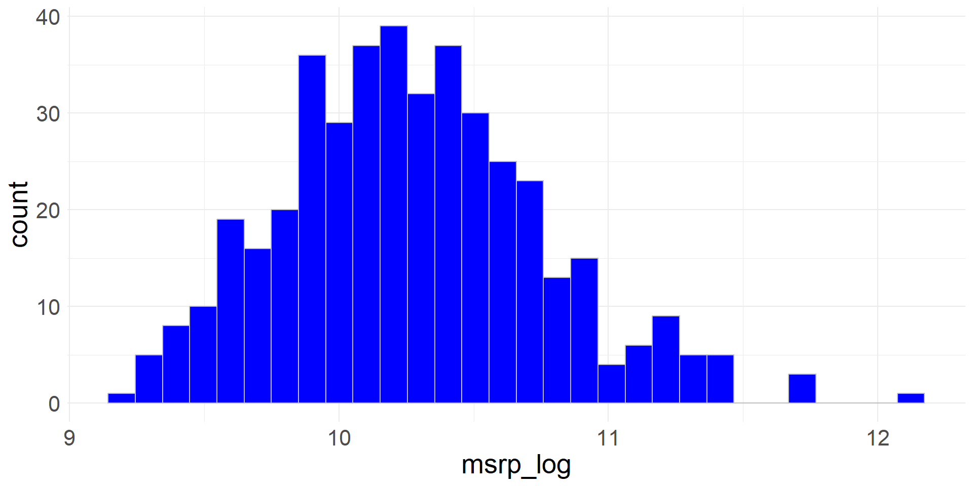
Exploring Numerical Data

Chapter 5
Math 215

Life Expectancies

  • Every county in the US (3,142 counties) in a data set life
  • Variables include county name, state, average life expectancy (expectancy), median income (income)
  • Let’s glimpse the data (we used pipe in this command)
library(tidyverse)

life |> glimpse()
Rows: 3,142
Columns: 4
$ state      <chr> "Alabama", "Alabama", "Alabama", "Alabama", "Alabama", "Ala…
$ county     <chr> "Autauga County", "Baldwin County", "Barbour County", "Bibb…
$ expectancy <dbl> 76.060, 77.630, 74.675, 74.155, 75.880, 71.790, 73.730, 73.…
$ income     <dbl> 37773, 40121, 31443, 29075, 31663, 25929, 33518, 33418, 312…

Selecting columns

  • We will focus on life expectancy in Massachusetts
  • filter gives us a subset of the rows and select gives us a subset of the columns in a data frame
  • We will filter the data to obtain a subset of the observations for MA counties and name it life_ma
life_ma <- life |>
  filter(state == "Massachusetts")
  • And select the county and expectancy columns
life_ma <- life_ma |>
  select(county, expectancy)
  • Let’s glimpse the resulting data set
life_ma |>
  glimpse()
Rows: 14
Columns: 2
$ county     <chr> "Barnstable County", "Berkshire County", "Bristol County", …
$ expectancy <dbl> 80.325, 79.780, 78.975, 80.995, 80.415, 80.070, 78.420, 80.…

Mutating columns

  • We can use the mutate function to create new columns from existing columns or to manipulate existing columns
  • Let’s round the life expectancies to whole numbers
life_ma <- life_ma |>
  mutate(expectancy = round(expectancy))
  • Let’s glimpse the resulting data set
life_ma |>
  glimpse()
Rows: 14
Columns: 2
$ county     <chr> "Barnstable County", "Berkshire County", "Bristol County", …
$ expectancy <dbl> 80, 80, 79, 81, 80, 80, 78, 80, 81, 80, 81, 79, 79, 80
  • We can chain several operations together with pipes
  • Data flows from left to right through the pipeline
  • The following code chains all of the operations together that we just performed
life_ma <- life |>
  filter(state == "Massachusetts") |>
  select(county, expectancy) |>
  mutate(expectancy = round(expectancy))

Life Expectancies in MA Counties

  • Now we can take a look on a dotplot of life expectancies for the fourteen MA counties
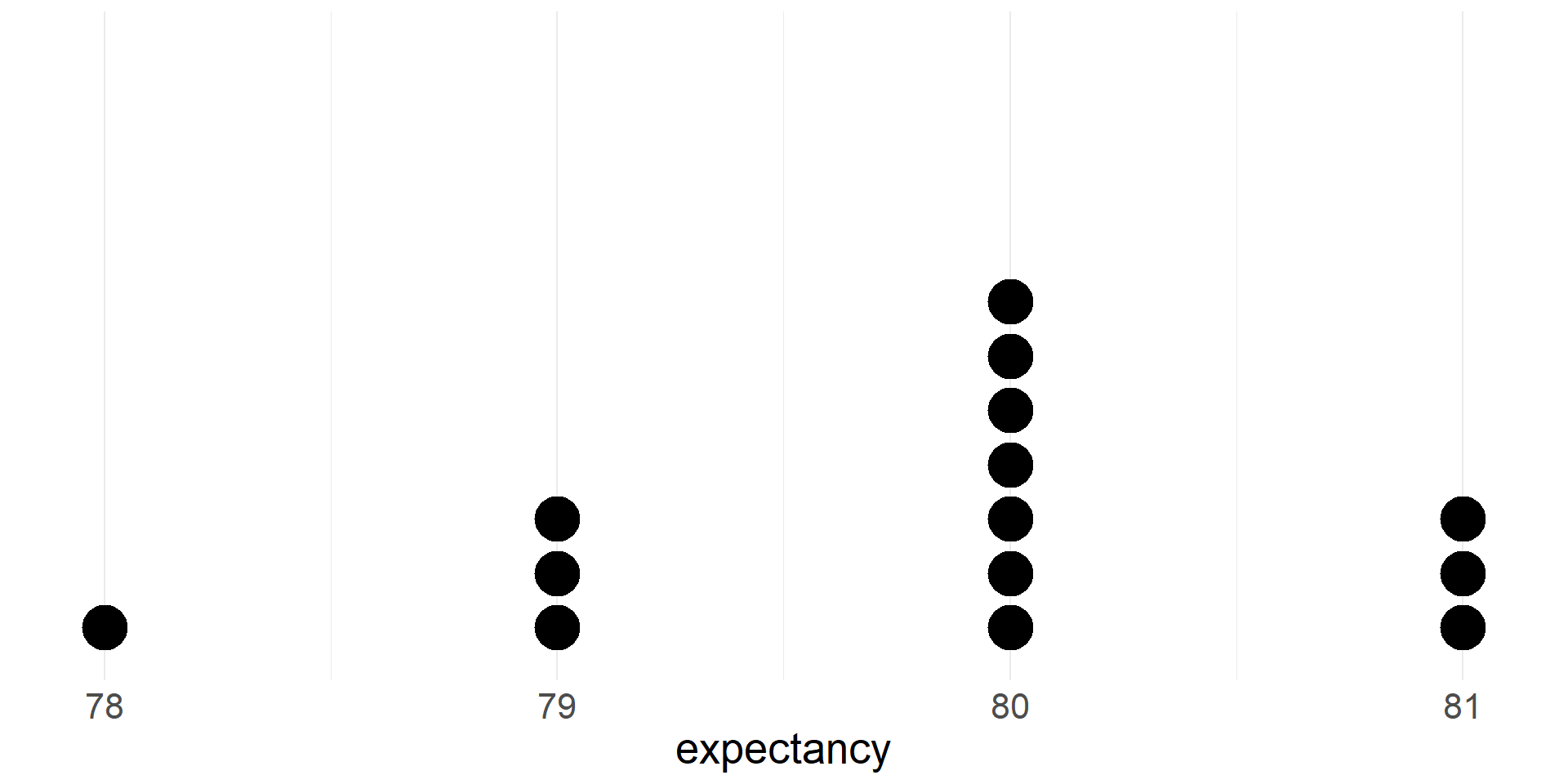
  • Shape: Skewed to the left, Unimodal
  • Mode = 80 (the most commonly occurring data point)
  • Max = 81, Min = 78, Range = Max - Min = 81-78=3

Summaries of numerical data

  • Measures of center

    • mean
    • median
  • Percentiles/quantiles

    • quartiles
    • other percentiles
  • Measures of spread

    • interquartile range
    • standard deviation

Mean

  • If there are \(n\) cases in a sample then the sample mean of the numeric variable \(x\) is \[\bar{x}=\frac{x_1+x_2+\cdots+x_n}{n}\]
  • The sample mean is a measure of the center of the distribution of the data
  • The sample mean \(\bar{x}\) (a statistic) gives us a point estimate of the population mean \(\mu\) (a parameter)

Median

  • The median is the value that splits the data in half
  • 50% of the data fall below the median
  • We can compute the mean and median of the life expectancy data and summarize them
life_ma |>
  summarize(mean = mean(expectancy), median = median(expectancy))
# A tibble: 1 × 2
   mean median
  <dbl>  <dbl>
1  79.9     80
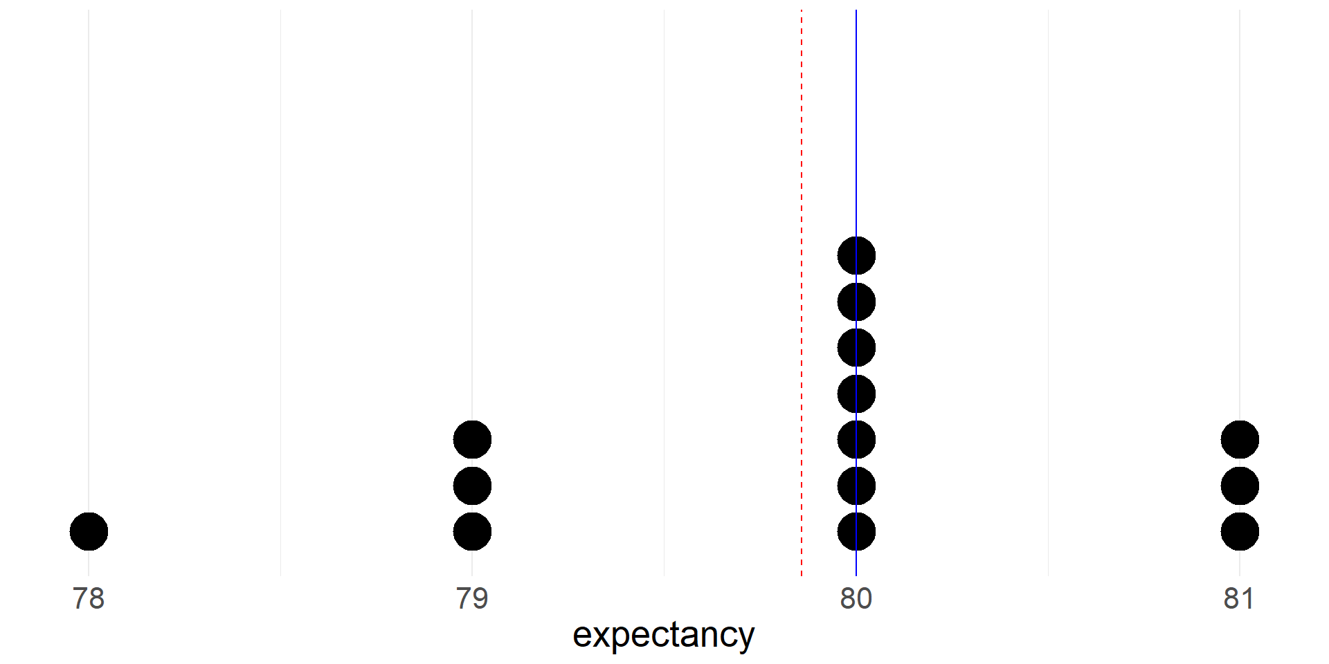
  • Let’s see where the mean and median fall on the dotplot
  • Note that the mean is pulled toward the left tail of the distribution.

Skew and Symmetry

Group means

  • We can also compare means between different groups in the data

  • Let’s compare the mean of the life expectancy variable between counties in West Coast states (California, Oregon, Washington) and counties that are not in West Coast states

  • First we add a new variable to the full data set that indicates whether a county is in a West Coast state

life <- life |>
  mutate(west_coast = if_else(state %in% c("California", "Oregon",
                                           "Washington"),
                              "yes",
                              "no"))
  • Next we group the data using the new west_coast variable
  • Then we use the summarize function to compute group means and medians
  • Is life expectancy higher in counties in west coast states?
life |>
  group_by(west_coast) |>
  summarize(mean = mean(expectancy), median = median(expectancy))
# A tibble: 2 × 3
  west_coast  mean median
  <chr>      <dbl>  <dbl>
1 no          77.1   77.3
2 yes         78.9   78.6

Percentiles

  • The Xth percentile is the value below which X% of the data fall
  • The median is the 50th percentile
  • Let’s compute the 90th percentile of the life expectancy variable in the Massachusetts data
quantile(life_ma$expectancy, 0.9)
90% 
 81 

Quartiles

  • The first quartile (Q1) is the 25th percentile, the value below which 25% of the data fall
  • The third quartile (Q3) is the 75th percentile, the value below which 75% of the data fall
  • The median is sometimes described as the second quartile (Q2)
  • Quartiles are often included in numerical summaries of a data set
  • Let’s add quartiles to our summary of the Massachusetts data
life_ma |>
  summarize(Q1 = quantile(expectancy, 0.25),
            median = median(expectancy),
            Q3 = quantile(expectancy, 0.75),
            mean = mean(expectancy))
# A tibble: 1 × 4
     Q1 median    Q3  mean
  <dbl>  <dbl> <dbl> <dbl>
1  79.2     80    80  79.9

Five number summary

  • Minimum, Q1, median, Q3 and maximum are called five number summary
  • Intrequartile Range (IQR)= Q3 - Q1
  • Range = Max - Min
life_ma |>
  summarize(min = min(expectancy),
            Q1 = quantile(expectancy, 0.25),
            median = median(expectancy),
            Q3 = quantile(expectancy, 0.75),
            max = max(expectancy),
            iqr = IQR(expectancy),
            range=max(expectancy)-min(expectancy))
# A tibble: 1 × 7
    min    Q1 median    Q3   max   iqr range
  <dbl> <dbl>  <dbl> <dbl> <dbl> <dbl> <dbl>
1    78  79.2     80    80    81  0.75     3

Box plot for the five number summary

  • The box extends from Q1 to Q3 with a vertical line at the median (Q2)
  • Whiskers extend from the box to the smallest and largest values that are not outliers
  • Outliers are plotted as individual points according to \(1.5\times\)IQR rule

# A tibble: 1 × 7
    min    Q1 median    Q3   max   iqr range
  <dbl> <dbl>  <dbl> <dbl> <dbl> <dbl> <dbl>
1    78  79.2     80    80    81  0.75     3

Identifying outliers using IQR

  • An outlier is an observation that is extreme relative to the rest of the data
  • There is no universally accepted method for identifying outliers
  • One common method uses the \(1.5\times\)IQR rule: a point is considered an outlier if it is larger than Q3+\(1.5\times\)IQR or smaller than Q1 - \(1.5\times\)IQR.
  • Let’s use this method to identify outliers in the life expectancy data for the whole country
iqr <- IQR(life$expectancy)
q1 <- quantile(life$expectancy, 0.25)
q3 <- quantile(life$expectancy, 0.75)

life <- life |>
  mutate(is_outlier = case_when(expectancy < q1 - 1.5*iqr ~ TRUE,
                                expectancy <= q3 + 1.5*iqr ~ FALSE,
                                TRUE ~ TRUE))
life |> count(is_outlier)
# A tibble: 2 × 2
  is_outlier     n
  <lgl>      <int>
1 FALSE       3130
2 TRUE          12
  • There are 12 counties identified as outliers
  • All of them have low life expectancies
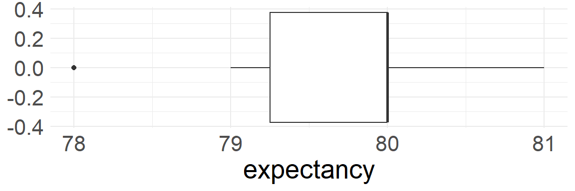
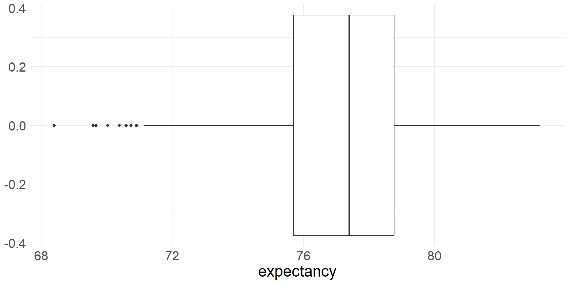
  • Here is the boxplot of the life expectancy of the entire dataset
life |>
  ggplot(aes(x = expectancy)) +
  geom_boxplot() +
  theme_minimal() +
  theme(text = element_text(size = 20))

Standard deviation

  • The most commonly used measure of variability is the standard deviation
  • The deviation of a single observation \(i\) is the difference between the observed value and the mean, \(x_i - \bar{x}\)
  • The standard deviation describes the typical deviation of the data from the mean
  • The sample variance is the average squared deviance \[s^2=\frac{(x_1-\bar{x})^2 + (x_2-\bar{x})^2 \cdots (x_n-\bar{x})^2}{n-1}\]
  • We divide by \(n-1\) rather than \(n\) (the sample size) to obtained an unbiased estimate of the population variance \(\sigma^2\). Otherwise \(s^2\) tends to underestimate \(\sigma^2\)
  • The sample standard deviation is \[s = \sqrt{s^2} = \sqrt{\frac{\sum_{i=1}^n(x_i-\bar{x})^2}{n-1}}\]

- For many numeric variables the following rules of thumb apply:

  • Roughly 68% of the data fall within 1 standard deviation of the mean
  • Roughly 95% of the data fall within 2 standard deviations of the mean
  • Roughly 99.7% of the data fall within 3 standard deviations of the mean

Illustrations of 68-95-99.7 rule. IMS1 Figure 5.7.

  • We can use the sd function to compute the sample standard deviation
life_ma |>
  summarize(sd = sd(expectancy),
            mean = mean(expectancy))
# A tibble: 1 × 2
     sd  mean
  <dbl> <dbl>
1 0.864  79.9

Cars

  • data on all new car models (428) in a certain year
  • 19 variables
  • includes weight, highway mpg (hwy_mpg), msrp, whether a pickup or not (pickup)
  • we will explore a variety of visualizations involving numerical variables
  • Let’s glimpse the data
glimpse(cars)
Rows: 428
Columns: 19
$ name        <chr> "Chevrolet Aveo 4dr", "Chevrolet Aveo LS 4dr hatch", "Chev…
$ sports_car  <lgl> FALSE, FALSE, FALSE, FALSE, FALSE, FALSE, FALSE, FALSE, FA…
$ suv         <lgl> FALSE, FALSE, FALSE, FALSE, FALSE, FALSE, FALSE, FALSE, FA…
$ wagon       <lgl> FALSE, FALSE, FALSE, FALSE, FALSE, FALSE, FALSE, FALSE, FA…
$ minivan     <lgl> FALSE, FALSE, FALSE, FALSE, FALSE, FALSE, FALSE, FALSE, FA…
$ pickup      <lgl> FALSE, FALSE, FALSE, FALSE, FALSE, FALSE, FALSE, FALSE, FA…
$ all_wheel   <lgl> FALSE, FALSE, FALSE, FALSE, FALSE, FALSE, FALSE, FALSE, FA…
$ rear_wheel  <lgl> FALSE, FALSE, FALSE, FALSE, FALSE, FALSE, FALSE, FALSE, FA…
$ msrp        <int> 11690, 12585, 14610, 14810, 16385, 13670, 15040, 13270, 13…
$ dealer_cost <int> 10965, 11802, 13697, 13884, 15357, 12849, 14086, 12482, 12…
$ eng_size    <dbl> 1.6, 1.6, 2.2, 2.2, 2.2, 2.0, 2.0, 2.0, 2.0, 2.0, 2.0, 1.7…
$ ncyl        <int> 4, 4, 4, 4, 4, 4, 4, 4, 4, 4, 4, 4, 4, 4, 4, 4, 4, 4, 4, 4…
$ horsepwr    <int> 103, 103, 140, 140, 140, 132, 132, 130, 110, 130, 130, 115…
$ city_mpg    <int> 28, 28, 26, 26, 26, 29, 29, 26, 27, 26, 26, 32, 36, 32, 29…
$ hwy_mpg     <int> 34, 34, 37, 37, 37, 36, 36, 33, 36, 33, 33, 38, 44, 38, 33…
$ weight      <int> 2370, 2348, 2617, 2676, 2617, 2581, 2626, 2612, 2606, 2606…
$ wheel_base  <int> 98, 98, 104, 104, 104, 105, 105, 103, 103, 103, 103, 103, …
$ length      <int> 167, 153, 183, 183, 183, 174, 174, 168, 168, 168, 168, 175…
$ width       <int> 66, 66, 69, 68, 69, 67, 67, 67, 67, 67, 67, 67, 67, 68, 66…

Dotplot

  • A dotplot represents each case with a dot
  • Dots are stacked on top of each other at the appropriate location on the x-axis
  • Let’s create a dot plot of vehicle weights
  • By default ggplot does not produce a useful y-axis scale, so we hide it
cars |>
  ggplot(aes(x = weight)) +
  geom_dotplot(dotsize = 0.2, stackratio = 1.2) +
  scale_y_continuous(NULL, breaks = NULL) + # hide meaningless y scale
  theme_minimal() +
  theme(text = element_text(size = 20))
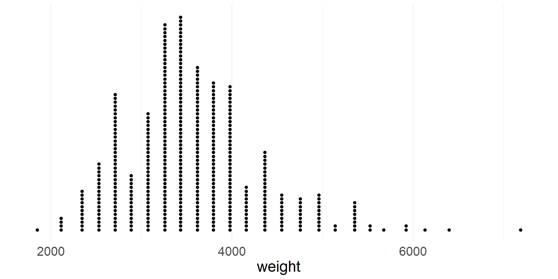
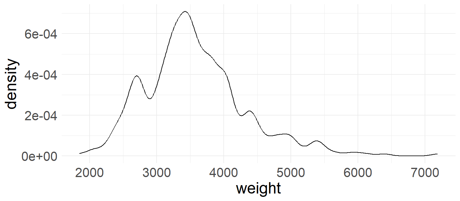
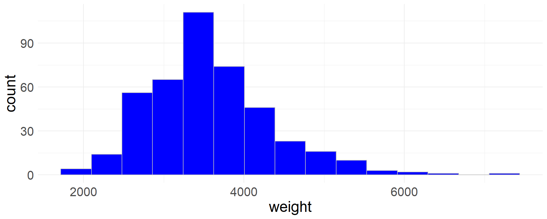
  • Note that the distribution of weights is skewed right, meaning that it has a tail on the right

Histogram

  • In a histogram data are aggregated into bins on the x-axis
  • The height of each bar is proportional to the number of cases in the bin
  • Let’s create a histogram of vehicle weights
cars |>
  ggplot(aes(x = weight)) +
  geom_histogram(col='gray',fill='blue') +
  theme_minimal() +
  theme(text = element_text(size = 20))
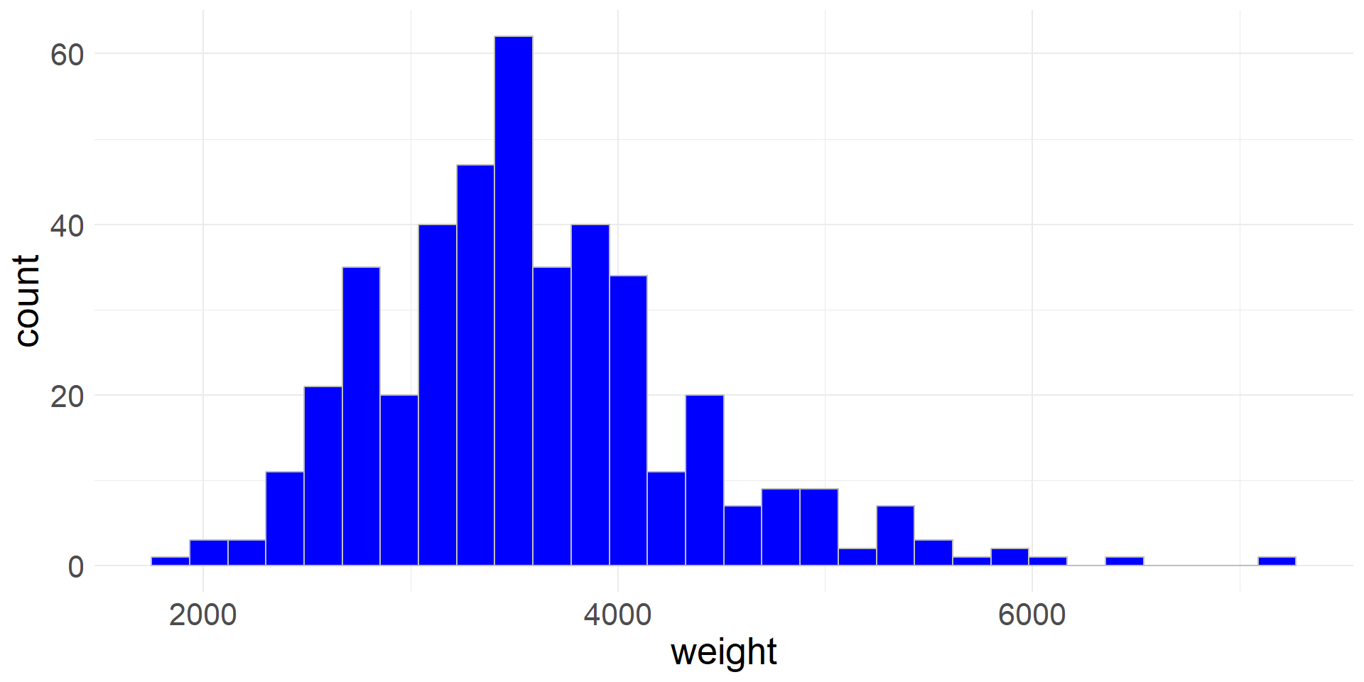
  • Rather than using the default values, we can also specify the number of bins (bins) or the bin width (binwidth)
  • Here we specify the number of bins
cars |>
  ggplot(aes(x = weight)) +
  geom_histogram(bins = 15,col='grey',fill='blue') +
  theme_minimal() +
  theme(text = element_text(size = 20))

Density plot

  • In a density plot the shape of the distribution is outlined by smooth line

  • Let’s create a density plot of vehicle weights (The bandwith (bw) controls the degree of smoothing)

cars |>
  ggplot(aes(x = weight)) +
  geom_density(bw=100) +
  theme_minimal() +
  theme(text = element_text(size = 20))

Scatter plot - visualizing 2 numerical variables

  • We can visualize two numeric variables using a scatter plot
  • Let’s plot highway gas mileage against vehicle weight
cars |>
  ggplot(aes(x = weight, y = hwy_mpg)) +
  geom_point() +
  theme_minimal() +
  theme(text = element_text(size = 20))

Faceted histograms

  • We can visualize two variables, where one is numeric and the other is categorical using faceted histograms
  • We simply plot a separate histogram for each level of the categorical variable
  • Let’s use a faceted histogram to visualize the distribution of highway mileage for vehicles that are pickups and vehicles that are not pickups
cars |>
  ggplot(aes(x = hwy_mpg,fill=pickup)) +
  geom_histogram(col='grey') +
  facet_wrap(~pickup, ncol = 1, scales = "free_y") +
  theme(text = element_text(size = 20))

Colored density plots

  • We can use colored density plots for a similar purpose-
  • By coloring the density plots according to the levels of the categorical variable, we can plot them on the same axes and still distinguish between the distributions
  • Let’s use colored density plots to visualize the distribution of highway mileage for vehicles that are pickups and vehicles that are not pickups
  • The level of alpha controls the transparency of the plots
cars |>
  ggplot(aes(x = hwy_mpg, fill = pickup)) +
  geom_density(alpha = 0.5) +
  theme_minimal() +
  theme(text = element_text(size = 20))

Transforming data

  • Sometimes it is helpful to transform a variable
  • For example, a log transformation is commonly applied to distributions that are strongly skewed to the right
  • The transformed variable is often more appropriate for analyses that use a mathematical model to approximate the distribution of the data
  • The msrp (manufacturer’s suggested retail price) data is skewed right
cars |>
  ggplot(aes(x = msrp)) +
  geom_histogram(col='grey', fill='blue') +
  theme_minimal() +
  theme(text = element_text(size = 20))
  • Let’s create a new variable by taking the (natural) log of the msrp variable
  • The transformed variable has a more symmetric, bell-shaped distribution
cars <- cars |>
  mutate(msrp_log = log(msrp))

cars |>
  ggplot(aes(x = msrp_log)) +
  geom_histogram(col='grey', fill='blue') +
  theme_minimal() +
  theme(text = element_text(size = 20))

Intensity Maps

  • Sometimes it is useful to use colors to show higher or lower values of variables
  • Using various colors or a continuous gradient we can visualize distribution of a variable
  • Intensity maps are very helpful for seeing geographical trends
ggplot(data = chi_health_map, aes(fill = Unemployment)) +
  geom_sf() + 
  scale_fill_gradient2(low = "green", mid = "purple", high = "red", midpoint = 20) +
  ggtitle("Unemployment rates in Chicago Community Areas")