| name | id | align | eye | hair | gender | gsm | alive | appearances | first_appear | publisher |
|---|---|---|---|---|---|---|---|---|---|---|
| Spider-Man (Peter Parker) | Secret | Good | Hazel Eyes | Brown Hair | Male | NA | Living Characters | 4043 | Aug-62 | marvel |
| Captain America (Steven Rogers) | Public | Good | Blue Eyes | White Hair | Male | NA | Living Characters | 3360 | Mar-41 | marvel |
| Wolverine (James \"Logan\" Howlett) | Public | Neutral | Blue Eyes | Black Hair | Male | NA | Living Characters | 3061 | Oct-74 | marvel |
| Iron Man (Anthony \"Tony\" Stark) | Public | Good | Blue Eyes | Black Hair | Male | NA | Living Characters | 2961 | Mar-63 | marvel |
| Thor (Thor Odinson) | No Dual | Good | Blue Eyes | Blond Hair | Male | NA | Living Characters | 2258 | Nov-50 | marvel |
| Benjamin Grimm (Earth-616) | Public | Good | Blue Eyes | No Hair | Male | NA | Living Characters | 2255 | Nov-61 | marvel |
| Reed Richards (Earth-616) | Public | Good | Brown Eyes | Brown Hair | Male | NA | Living Characters | 2072 | Nov-61 | marvel |
| Hulk (Robert Bruce Banner) | Public | Good | Brown Eyes | Brown Hair | Male | NA | Living Characters | 2017 | May-62 | marvel |
| Scott Summers (Earth-616) | Public | Neutral | Brown Eyes | Brown Hair | Male | NA | Living Characters | 1955 | Sep-63 | marvel |
| Jonathan Storm (Earth-616) | Public | Good | Blue Eyes | Blond Hair | Male | NA | Living Characters | 1934 | Nov-61 | marvel |
Exploring Data
Topic 2
Math 115
Math 115
Inferential statistics
- It is usually impractical to make observations on every individual in a population (this type of study is called a census)
- Instead select a sample from the population and use observations made on the sample to make inferences about the population
Example: The Hope College Biology Department would like to know the proportion of hemlock trees in the Hope College Nature Preserve (HCNP) that are infested by hemlock woolly adelgid (HWA)
- Census: researchers inspect every hemlock in the preserve (the population) for HWA infestation and calculate the proportion
- Survey: researchers randomly select 100 hemlock trees in the preserve (a sample) inspect them and calculate the proportion
Parameter vs. statistic
- A statistic is a numerical value or summary measure that is calculated from a sample
- A parameter is the corresponding value in the population
- The value of statistic give us an estimate of the value of the corresponding parameter
Identify the parameter and the statistic.
- The proportion of trees infested with HWA in a sample of 100 hemlocks from the HCNP
- The proportion of trees infested with HWA in the HCNP
Anecdotal Evidence
- Anecdotal evidence refers to personal stories, experiences, or individual observations
- Example:A man on the news got mercury poisoning from eating swordfish, so the average mercury concentration in swordfish must be dangerously high.
- Inferences should not be made using anecdotal evidence or data that are collected in a haphazard manner
- Such information may not be representative of the population
- Instead, inferences should be based on carefully designed studies
Identify anecdotal evidence.
- Your friend, who recently visited the HCNP, stated that they noticed that about half the hemlocks seemed to be infested with HWA
- Students from an introductory Biology lab use a map to select 50 hemlocks in the HCNP. They visit the trees and record whether each one has signs of infestation with HWA
EDA for Categorical Variables
15,128 comic characters from DC and Marvel comics
11 variables, including
- name
- identity (id) gives information about personal identity (e.g., identity is kept secret)
- alignment (align) gives information about whether character is good, bad, etc
The
comicsdata set is saved in a CSV fileLet’s download the file and open it with Jamovi
- First 10 rows of the comics data
Describing categorical data
- We can summarize a single categorical variable using a frequency table
- Counts the number of observations for each level of the variable
| identity | count |
|---|---|
| No Dual | 1,394 |
| Public | 5,656 |
| Secret | 7,281 |
| Unknown | 9 |
| Total | 15,128 |
Proportion Calculations
Example 1: What proportion of comic characters have a secret identity?
\(Proportion=\frac{Count}{Total}=\frac{7,691}{15,128}=0.508\)
Example 2: What percentage of comic characters have a secret identity?
\(Percentage=Proportion\times 100=0.508×100=50.8\%\)
- Here are the resulting proportions
| identity | proportion |
|---|---|
| No Dual | 0.097 |
| Public | 0.394 |
| Secret | 0.508 |
| Unknown | 0.001 |
Visualizing categorical data
- We can use a bar plot to visualize categorical data
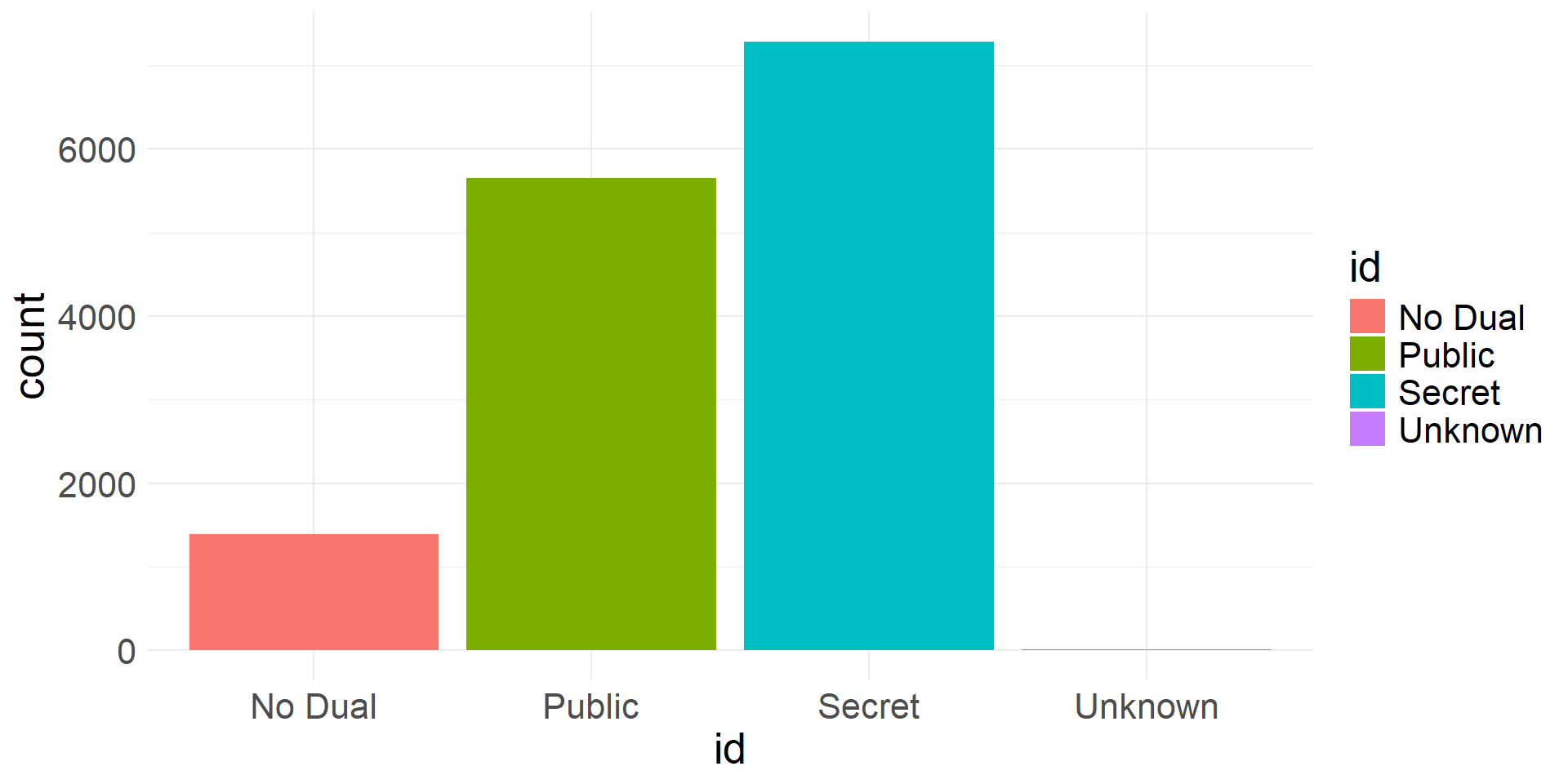
Bar plot showing frequencies of levels of identity variable
Summarizing two categorical variables
- A contingency table is a table that can be used to summarize two categorical variables
- Each value is a count of the number of times a variable outcome combination occurs
- Usually includes row and column totals as well (marginal totals)
| align | No Dual | Public | Secret | Unknown | Total |
|---|---|---|---|---|---|
| Bad | 435 | 2,031 | 4,119 | 7 | 6,592 |
| Good | 598 | 2,726 | 2,296 | 0 | 5,620 |
| Neutral | 361 | 898 | 865 | 2 | 2,126 |
| Reformed Criminals | 0 | 1 | 1 | 0 | 2 |
| Total | 1,394 | 5,656 | 7,281 | 9 | 14,340 |
- It is also useful to create contingency tables with proportions
- The simplest version is obtained by dividing each count by the grand total
- In this case values in table sum to 1
| align | No Dual | Public | Secret | Unknown |
|---|---|---|---|---|
| Bad | 0.0303 | 0.1416 | 0.2872 | 0.0005 |
| Good | 0.0417 | 0.1901 | 0.1601 | 0.0000 |
| Neutral | 0.0252 | 0.0626 | 0.0603 | 0.0001 |
| Reformed Criminals | 0.0000 | 0.0001 | 0.0001 | 0.0000 |
- What does the value 0.0299 mean?
Conditional proportions
- We can also create tables of conditional proportions than can be helpful to explore associations between the variables
- We need to decide whether the proportions should be conditioned on rows (divide counts by row totals) or columns (divide counts by colum totals)
- If conditioned on rows, proportions sum to 1 along rows
- If conditioned on columns, proportions sum to 1 along columns
- These proportions are conditioned on rows (alignment)
- Allows us to compare proportions of identity types between different alignment groups
- For example, we can see that about 63% of bad characters have secret identities whereas only about 41% of good characters have secret identities.
| align | No Dual | Public | Secret | Unknown |
|---|---|---|---|---|
| Bad | 0.0660 | 0.3081 | 0.6248 | 0.0011 |
| Good | 0.1064 | 0.4851 | 0.4085 | 0.0000 |
| Neutral | 0.1698 | 0.4224 | 0.4069 | 0.0009 |
| Reformed Criminals | 0.0000 | 0.5000 | 0.5000 | 0.0000 |
- These proportions are conditioned on columns (identity)
- Allows us to compare proportions of alignment types between different identity groups
- For example, we can see that about 57% characters with secret identities are bad, whereas only about 32% of characters with secret identities are good.
| align | No Dual | Public | Secret | Unknown |
|---|---|---|---|---|
| Bad | 0.3121 | 0.3591 | 0.5657 | 0.7778 |
| Good | 0.4290 | 0.4820 | 0.3153 | 0.0000 |
| Neutral | 0.2590 | 0.1588 | 0.1188 | 0.2222 |
| Reformed Criminals | 0.0000 | 0.0002 | 0.0001 | 0.0000 |
Visualizing two categorical variables
- There are different ways to visualize two categorical variables using bar plots
- We can create stacked bar plot
- Colors show how composition varies within each group
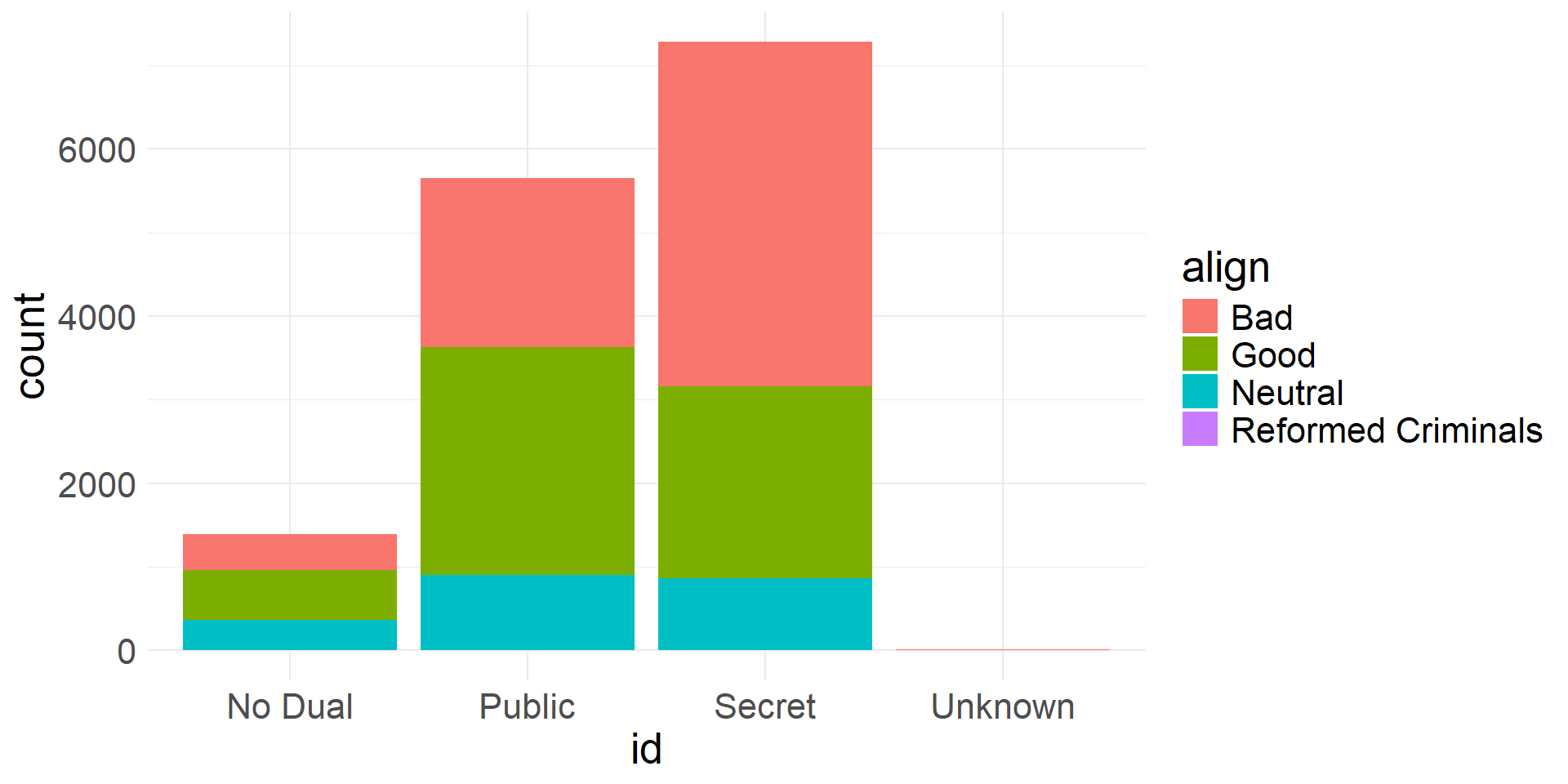
Stacked bar plot showing alignment frequencies for different id levels
- We can also visualize the data using side-by-side (dodged) bar plots
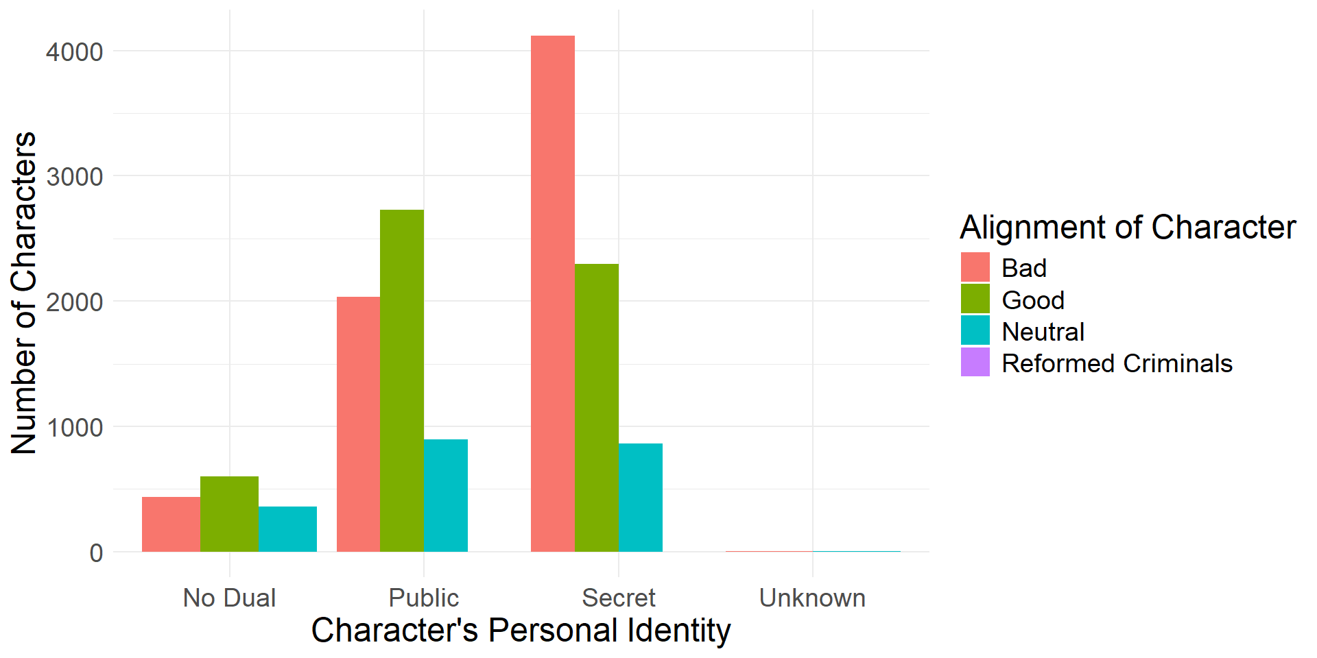
Dodged bar plot showing alignment frequencies for different id levels
- Another alternative is to use faceted bar plots
- Facet according to one of the variables
- A facet (subplot) is created for each level of that variable
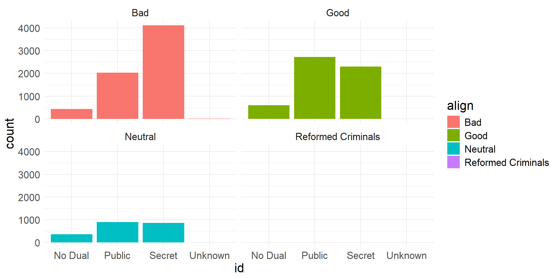
Faceted bar plot showing alignment frequencies for different id levels
- A fourth type of bar plot we can use to visualize two categorical variables is a standardized (filled) bar plot
- This shows conditional proportions (instead of counts) in a stacked format
- The following proportions are conditioned on
id
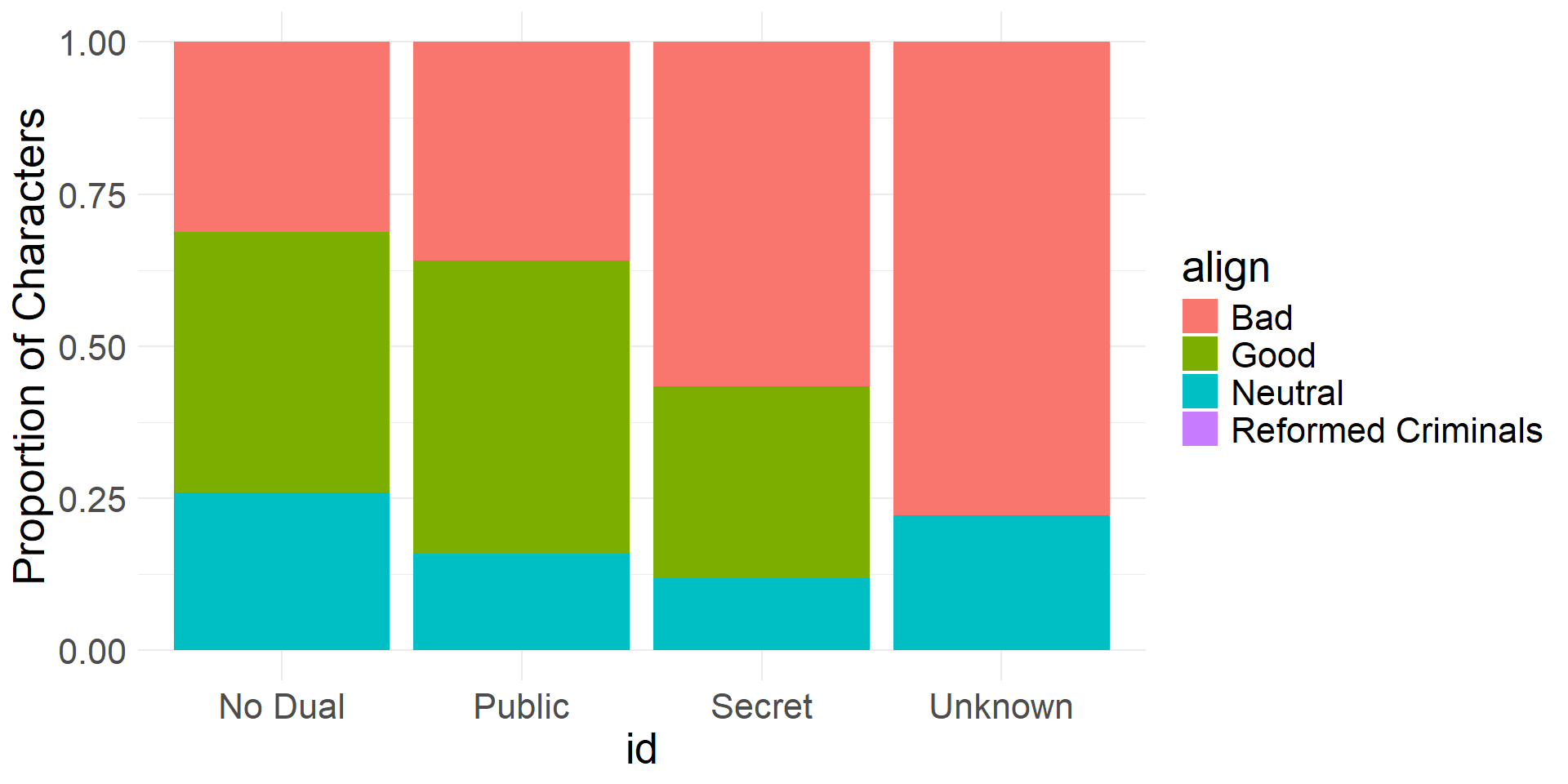
Standardized bar plot showing alignment proportions for different id levels
- We can take a different perspective by exchanging the roles of the variables
- The following proportions are conditioned on
align
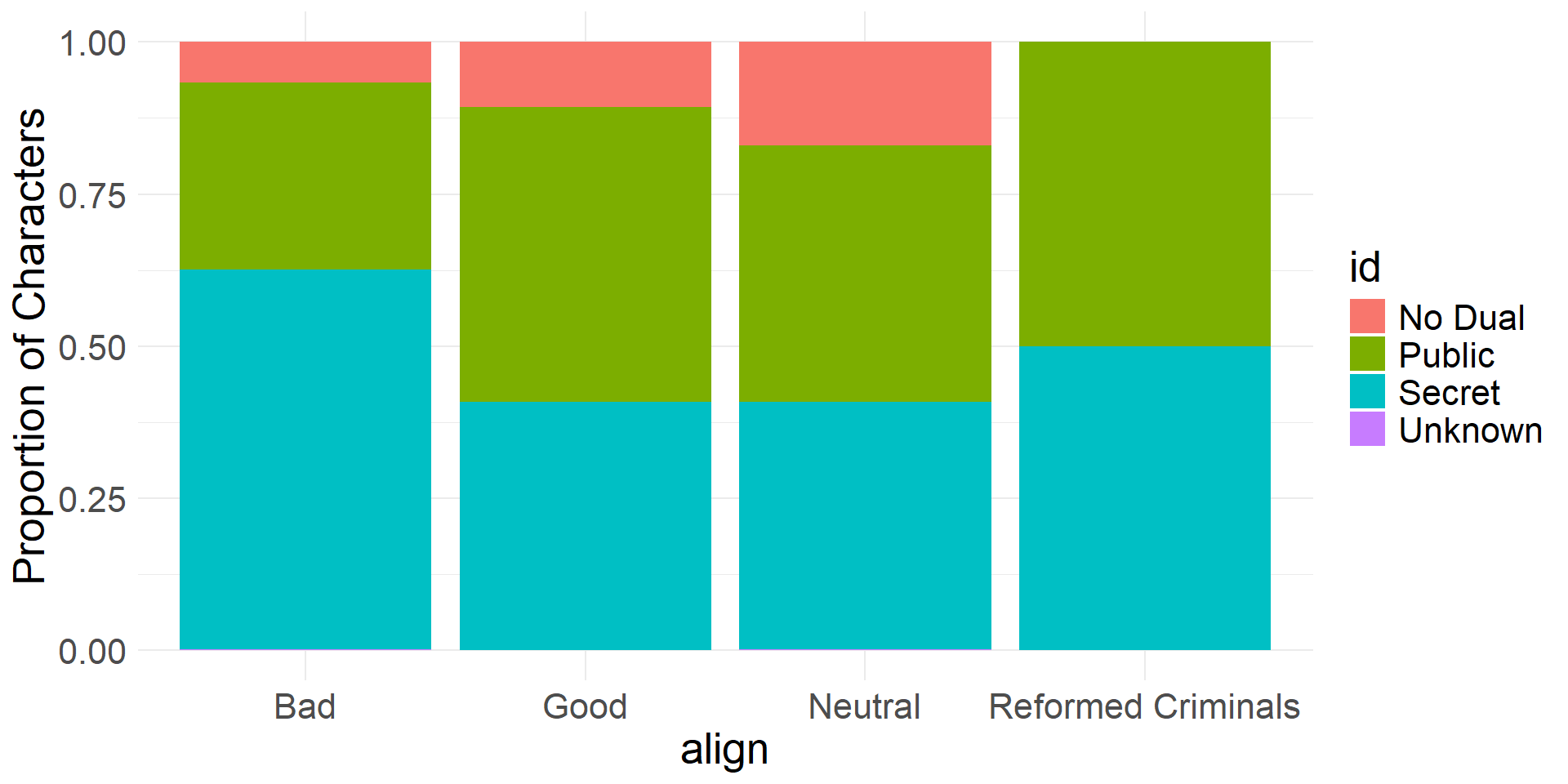
Standardized bar plot showing id proportions for different alignment levels
EDA for Quantitative Variables
- Every county in the US (3,142 counties)
- Variables include county name, state, average life expectancy (expectancy), median income (income)
- First 15 rows of
life_expdata
| state | county | expectancy | income |
|---|---|---|---|
| Alabama | Autauga County | 76.060 | 37773 |
| Alabama | Baldwin County | 77.630 | 40121 |
| Alabama | Barbour County | 74.675 | 31443 |
| Alabama | Bibb County | 74.155 | 29075 |
| Alabama | Blount County | 75.880 | 31663 |
| Alabama | Bullock County | 71.790 | 25929 |
| Alabama | Butler County | 73.730 | 33518 |
| Alabama | Calhoun County | 73.300 | 33418 |
| Alabama | Chambers County | 73.245 | 31282 |
| Alabama | Cherokee County | 74.650 | 32645 |
| Alabama | Chilton County | 73.880 | 31380 |
| Alabama | Choctaw County | 75.050 | 31046 |
| Alabama | Clarke County | 74.820 | 31877 |
| Alabama | Clay County | 74.145 | 32965 |
| Alabama | Cleburne County | 74.145 | 31209 |
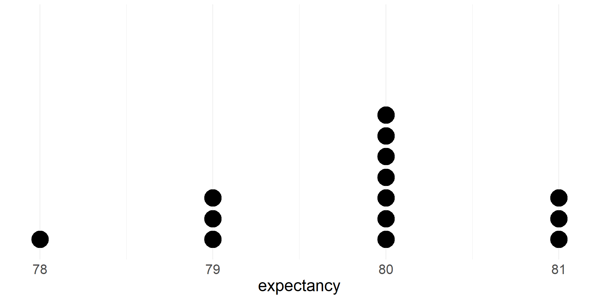
Life Expectancies in MA Counties
- For now, we will focus on life expectancy in Massachusetts (14 counties)
- Since the
life_expdata include all US counties, we need to filter the data to retain just the Massachusetts counties - You can filter a data set using Jamovi (or another spreadsheet program)
- Here are 14 counties of Massachusetts in the filtered
life_expdata
| state | county | expectancy | income |
|---|---|---|---|
| Massachusetts | Barnstable County | 80.325 | 64730 |
| Massachusetts | Berkshire County | 79.780 | 50712 |
| Massachusetts | Bristol County | 78.975 | 48294 |
| Massachusetts | Dukes County | 80.995 | 78745 |
| Massachusetts | Essex County | 80.415 | 60320 |
| Massachusetts | Franklin County | 80.070 | 48428 |
| Massachusetts | Hampden County | 78.420 | 46216 |
| Massachusetts | Hampshire County | 80.040 | 46756 |
| Massachusetts | Middlesex County | 81.240 | 73265 |
| Massachusetts | Nantucket County | 80.325 | 107341 |
| Massachusetts | Norfolk County | 81.115 | 80711 |
| Massachusetts | Plymouth County | 79.145 | 59273 |
| Massachusetts | Suffolk County | 79.260 | 66074 |
| Massachusetts | Worcester County | 79.550 | 51370 |
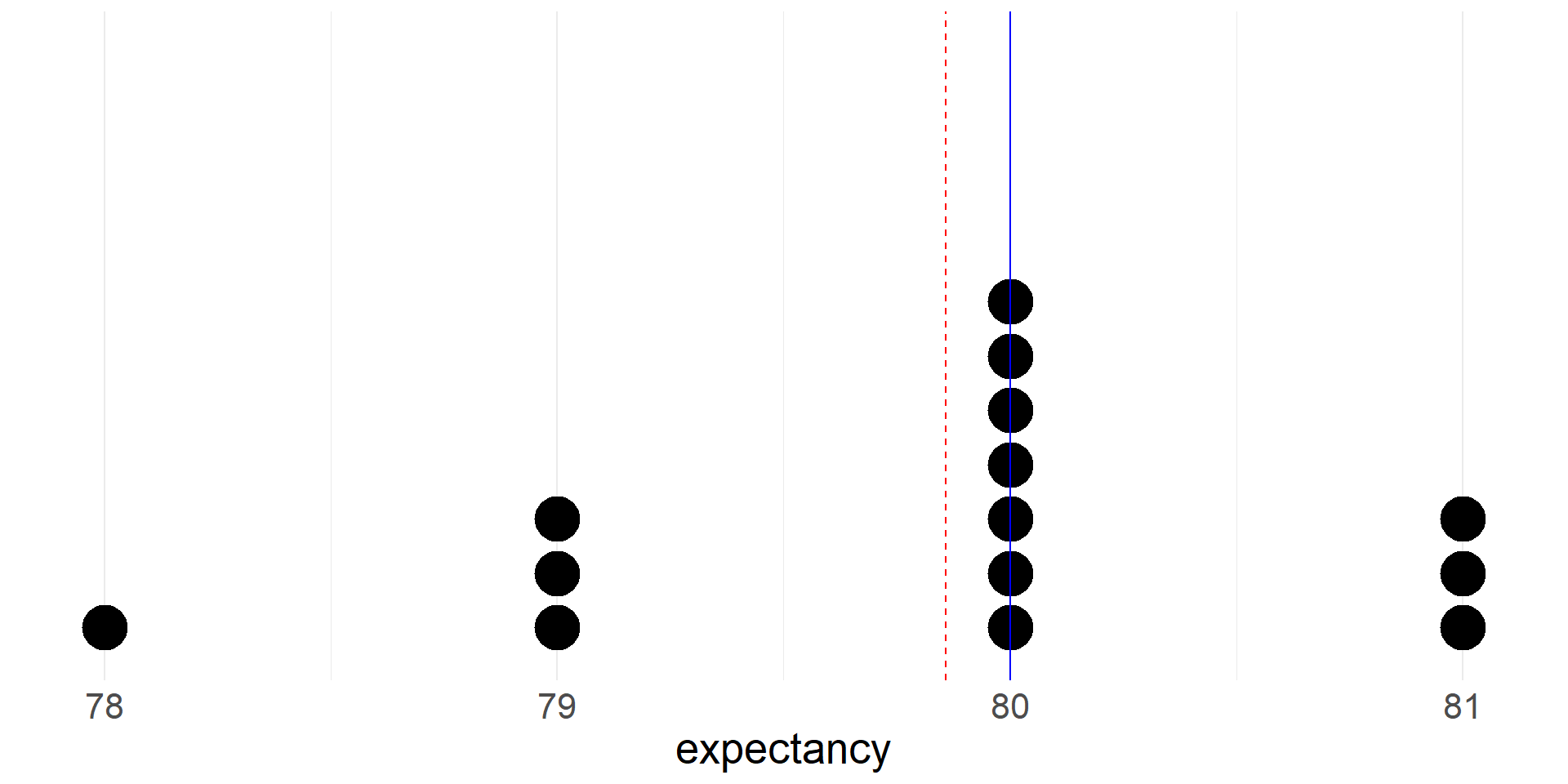
- Let’s take a quick peak at a dotplot of life expectancies for the MA counties (we rounded values to the nearest integer)
Summaries of numerical data
Measures of center
- mean
- median
Percentiles/quantiles
- quartiles
- other percentiles
Measures of spread
- interquartile range
- standard deviation
Mean
- If there are \(n\) cases in a sample then the sample mean of the numeric variable \(x\) is \[\bar{x}=\frac{x_1+x_2+\cdots+x_n}{n}\]
- The sample mean is a measure of the center of the distribution of the data
- The sample mean \(\bar{x}\) (a statistic) gives us a point estimate of the population mean \(\mu\) (a parameter)
The mean life expectancy in Massachusetts counties is 79.9 years
| mean |
|---|
| 79.85714 |
Median
- The median is the value that splits the data in half
- 50% of the data fall below the median
- We can also compute the median of the life expectancy data
| mean | median |
|---|---|
| 79.85714 | 80 |
- Let’s see where the mean and median fall on the dotplot
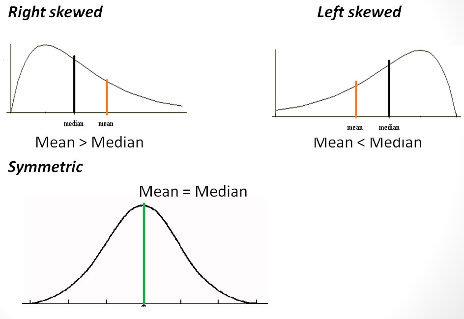
- The mean is red and dashed. Note that it is pulled toward the thicker left tail of the distribution.
Skew and Symmetry
Group means
- We can also compare means between different groups in the data
- Let’s compare the mean of the life expectancy variable between counties in West Coast states (California, Oregon, Washington) and counties that are not in West Coast states
- Is life expectancy higher in counties in west coast states?
| west_coast | mean | median |
|---|---|---|
| no | 77.12750 | 77.31 |
| yes | 78.90545 | 78.65 |
Percentiles
- The Xth percentile is the value below which X% of the data fall
- The median is the 50th percentile
- For example, the 90th percentile of the life expectancy variable in the Massachusetts data is 81 years, meaning that 90% of the counties have an average life expectancy that is less than 81 years
Quartiles
- The first quartile (Q1) is the 25th percentile, the value below which 25% of the data fall
- The third quartile (Q3) is the 75th percentile, the value below which 75% of the data fall
- The median is sometimes described as the second quartile (Q2)
- Quartiles are often included in numerical summaries of a data set
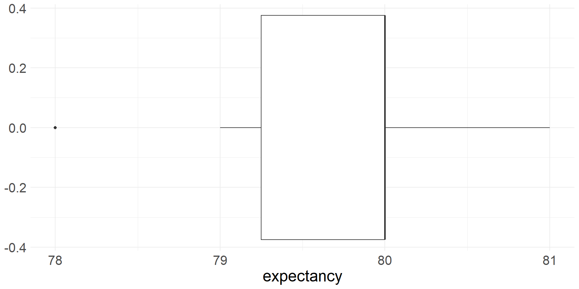
- Let’s add quartiles to our summary of the Massachusetts county life expectancy data
| Q1 | median | Q3 | mean |
|---|---|---|---|
| 79.25 | 80 | 80 | 79.85714 |
Five Number Summary
- Maximum and minimum values in a data set are often included numerical summaries as well
- Let’s add them to our summary of the Massachusetts county life expectancy data
| min | Q1 | median | Q3 | max | mean |
|---|---|---|---|---|---|
| 78 | 79.25 | 80 | 80 | 81 | 79.85714 |
Boxplot
- A box plot is a visual represenation of the five number summary
- Boxplots are constructed using summary statistics:
- The box extends from Q1 to Q3 with a vertical line at the median (Q2)
- Whiskers extend from the box to the smallest and largest values that are not outliers
- Outliers are plotted as individual points
Range
- The simplest measure of spread/variability of a distribution of data is the range
- It is simply the difference between the largest and smallest values
- The range is \(81-78=3\) years for the Massachusetts county life expectancy data
| range |
|---|
| 3 |
Interquartile range
- The interquartile range (IQR) is the difference Q3-Q1
- The IQR will never be larger than the range!
- Th IQR is \(80-79.25=0.75\) years for the Massachusetts county life expectancy data
| iqr | range |
|---|---|
| 0.75 | 3 |
Standard deviation
- The most commonly used measure of variability is the standard deviation
- The deviation of a single observation \(i\) is the difference between the observed value and the mean, \(x_i - \bar{x}\)
- The standard deviation describes the typical deviation of the data from the mean
- The sample variance is the average squared deviance \[s^2=\frac{(x_1-\bar{x})^2 + (x_2-\bar{x})^2 \cdots (x_n-\bar{x})^2}{n-1}\]
- We divide by \(n-1\) rather than \(n\) (the sample size) to obtained an unbiased estimate of the population variance \(\sigma^2\). Otherwise \(s^2\) tends to underestimate \(\sigma^2\)
- The sample standard deviation is \[s = \sqrt{s^2} = \sqrt{\frac{\sum_{i=1}^n(x_i-\bar{x})^2}{n-1}}\]
- For many numeric variables the following rules of thumb apply:
- Roughly 68% of the data fall within 1 standard deviation of the mean
- Roughly 95% of the data fall within 2 standard deviations of the mean
- Roughly 99.7% of the data fall within 3 standard deviations of the mean
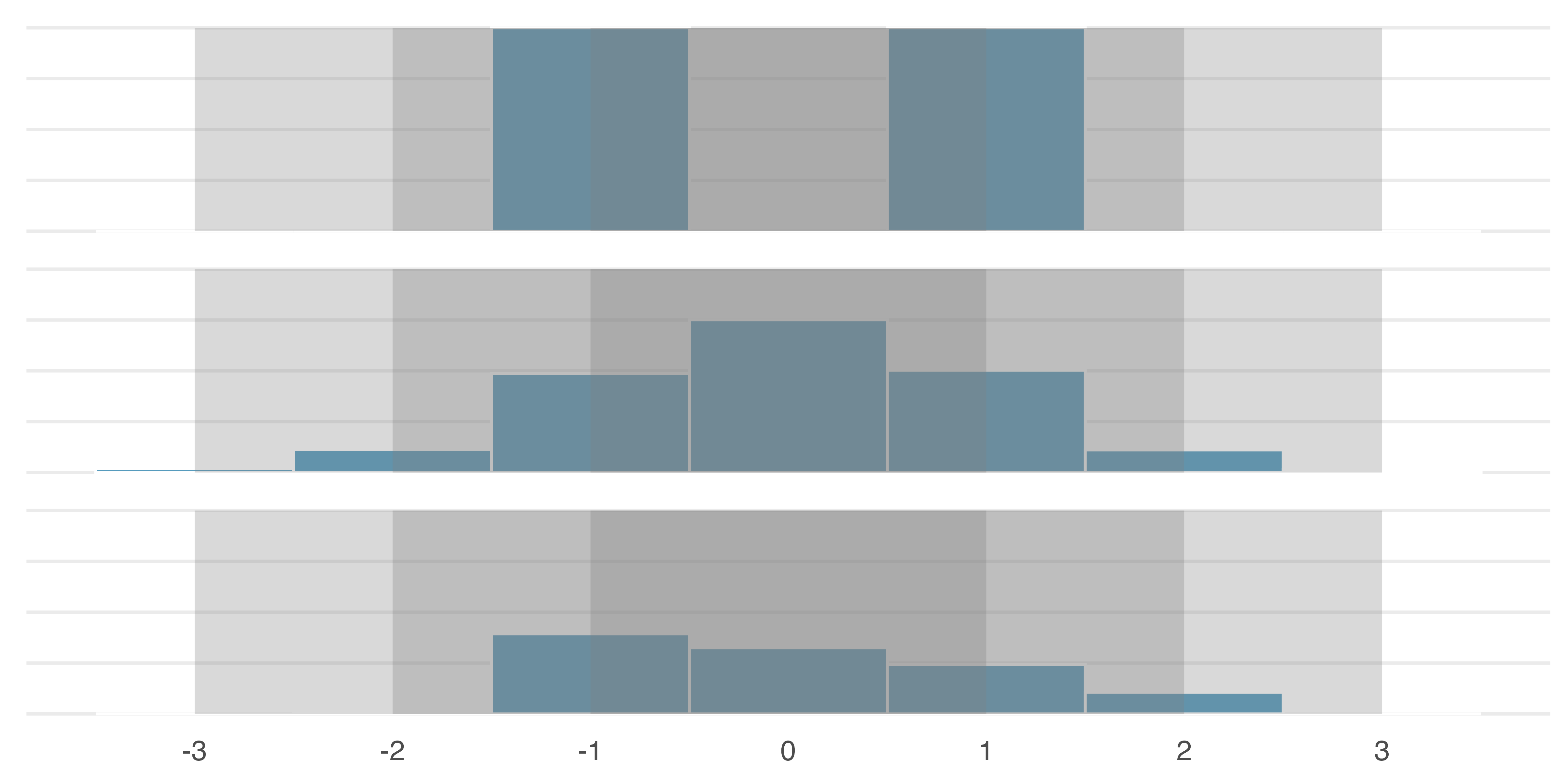
Illustrations of 68-95-99.7 rule. IMS2 Figure 5.7.
- The standard deviation for the Massachusetts county life expectancy data is 0.864 years
| sd | iqr | range |
|---|---|---|
| 0.8644378 | 0.75 | 3 |
Identifying outliers using IQR
- An outlier is an observation that is extreme relative to the rest of the data
- There is no universally accepted method for identifying outliers
- One common method that is also simple uses the IQR
- With this method, a point is considered an outlier if it is larger than Q3 or smaller than Q1 by more than \(1.5\times\)IQR.
- Let’s use this method to identify outliers in the life expectancy data for the whole country
- For the whole country, \(Q1=75.70\) years and \(Q3=78.77\) years
- Thus, \(IQR = 78.77-75.70=3.07\)
- Any county with a life expectancy less than \(75.70-1.5\times3.07=71.09\) years or greater than \(78.77+1.5\times3.07=80.31\) years is considered an outlier
- Using the \(1.5\times\)IQR rule, 12 counties identified as outliers
- All have low life expectancies
| state | county | expectancy |
|---|---|---|
| Arkansas | Mississippi County | 70.915 |
| Arkansas | Phillips County | 70.900 |
| Mississippi | Coahoma County | 70.740 |
| Virginia | Petersburg City | 70.740 |
| Mississippi | Washington County | 70.595 |
| West Virginia | Mingo County | 70.590 |
| Mississippi | Sunflower County | 70.385 |
| Mississippi | Quitman County | 70.030 |
| Mississippi | Tunica County | 70.030 |
| Mississippi | Bolivar County | 69.675 |
| Kentucky | Perry County | 69.585 |
| West Virginia | Mcdowell County | 68.400 |
Cars
- data on all new car models (428) in a certain year
- 19 variables
- includes weight, highway mpg (hwy_mpg), msrp, whether a pickup or not (pickup)
- we will explore a variety of visualizations involving numerical variables
- Here are the first 8 rows
| name | sports_car | suv | wagon | minivan | pickup | all_wheel | rear_wheel | msrp | dealer_cost | eng_size | ncyl | horsepwr | city_mpg | hwy_mpg | weight | wheel_base | length | width |
|---|---|---|---|---|---|---|---|---|---|---|---|---|---|---|---|---|---|---|
| Chevrolet Aveo 4dr | FALSE | FALSE | FALSE | FALSE | FALSE | FALSE | FALSE | 11690 | 10965 | 1.6 | 4 | 103 | 28 | 34 | 2370 | 98 | 167 | 66 |
| Chevrolet Aveo LS 4dr hatch | FALSE | FALSE | FALSE | FALSE | FALSE | FALSE | FALSE | 12585 | 11802 | 1.6 | 4 | 103 | 28 | 34 | 2348 | 98 | 153 | 66 |
| Chevrolet Cavalier 2dr | FALSE | FALSE | FALSE | FALSE | FALSE | FALSE | FALSE | 14610 | 13697 | 2.2 | 4 | 140 | 26 | 37 | 2617 | 104 | 183 | 69 |
| Chevrolet Cavalier 4dr | FALSE | FALSE | FALSE | FALSE | FALSE | FALSE | FALSE | 14810 | 13884 | 2.2 | 4 | 140 | 26 | 37 | 2676 | 104 | 183 | 68 |
| Chevrolet Cavalier LS 2dr | FALSE | FALSE | FALSE | FALSE | FALSE | FALSE | FALSE | 16385 | 15357 | 2.2 | 4 | 140 | 26 | 37 | 2617 | 104 | 183 | 69 |
| Dodge Neon SE 4dr | FALSE | FALSE | FALSE | FALSE | FALSE | FALSE | FALSE | 13670 | 12849 | 2.0 | 4 | 132 | 29 | 36 | 2581 | 105 | 174 | 67 |
| Dodge Neon SXT 4dr | FALSE | FALSE | FALSE | FALSE | FALSE | FALSE | FALSE | 15040 | 14086 | 2.0 | 4 | 132 | 29 | 36 | 2626 | 105 | 174 | 67 |
| Ford Focus ZX3 2dr hatch | FALSE | FALSE | FALSE | FALSE | FALSE | FALSE | FALSE | 13270 | 12482 | 2.0 | 4 | 130 | 26 | 33 | 2612 | 103 | 168 | 67 |
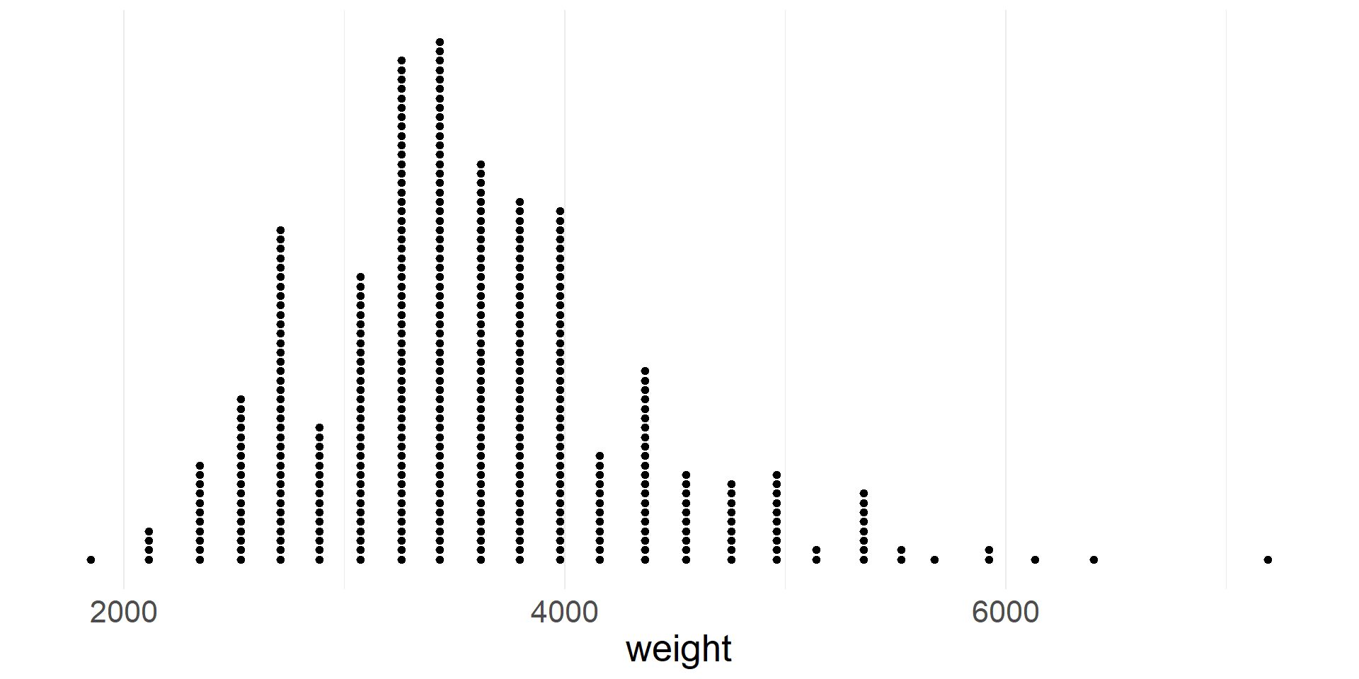
Dotplot
- A dotplot represents each case with a dot
- Dots are stacked on top of each other at the appropriate location on the x-axis
- Dot plot of vehicle weights
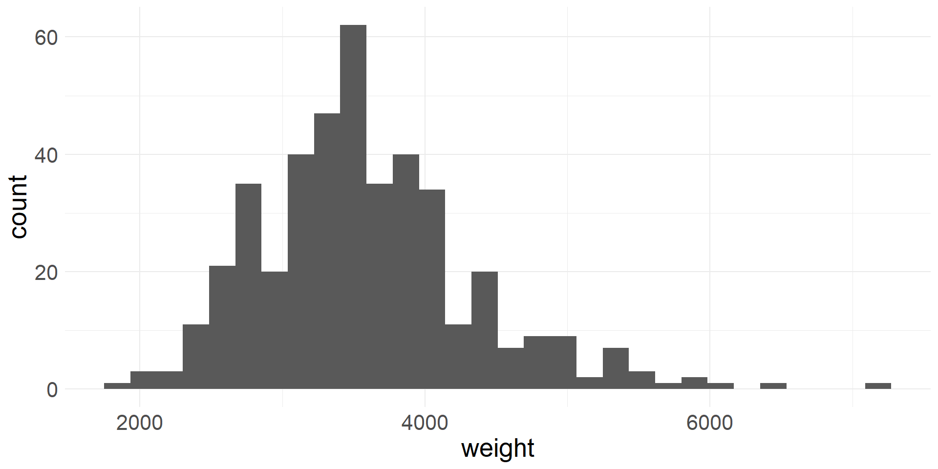
Histogram
- In a histogram data are aggregated into bins on the x-axis
- The height of each bar is proportional to the number of cases in the bin
- Histogram of vehicle weights
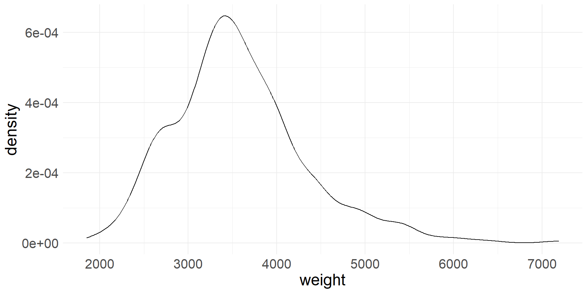
Density plot
- In a density plot the shape of the distribution is represented using a smooth line (think of this as a smoothed out histogram)
- Density plot of vehicle weights
Box plot
- Box plot of vehicle weights. Are there any outliers?
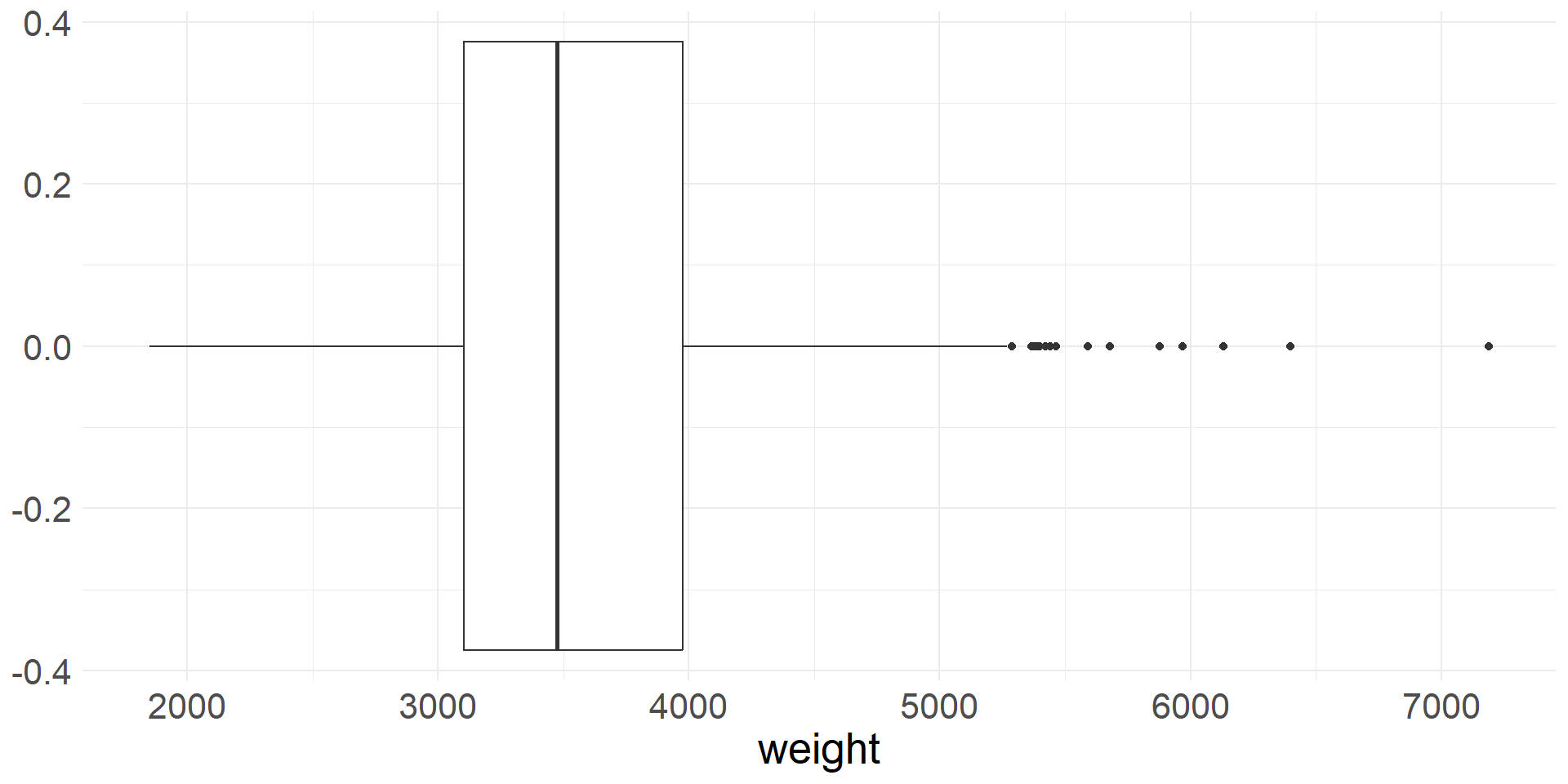
- It is important to note that box plots can miss important characteristics of the distributions
- For example, if the distribution is bimodal, then the box plot won’t show it
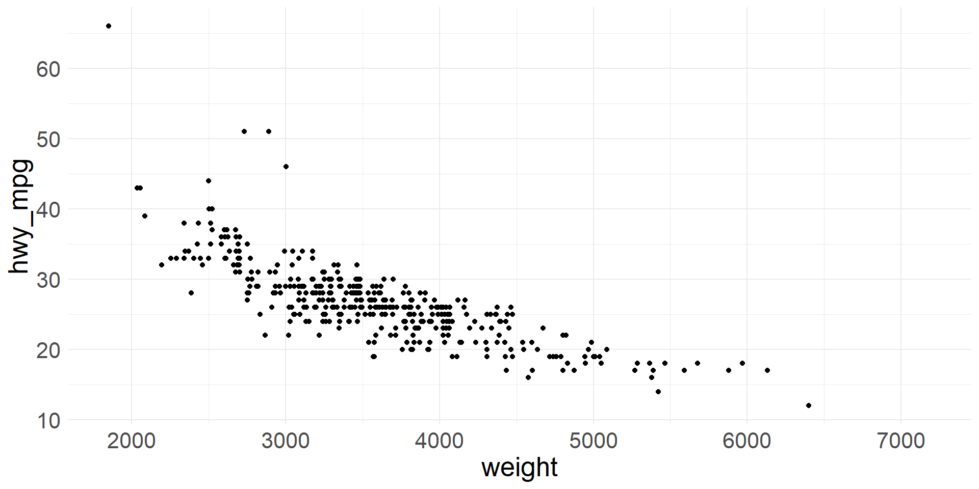
Scatter plot - visualizing 2 numerical variables
- We can visualize two numeric variables using a scatter plot
- Typically, the x-axis is used for the explanatory variable and y-axis for the response variable
- A scatter plot of highway gas mileage vs. vehicle weight
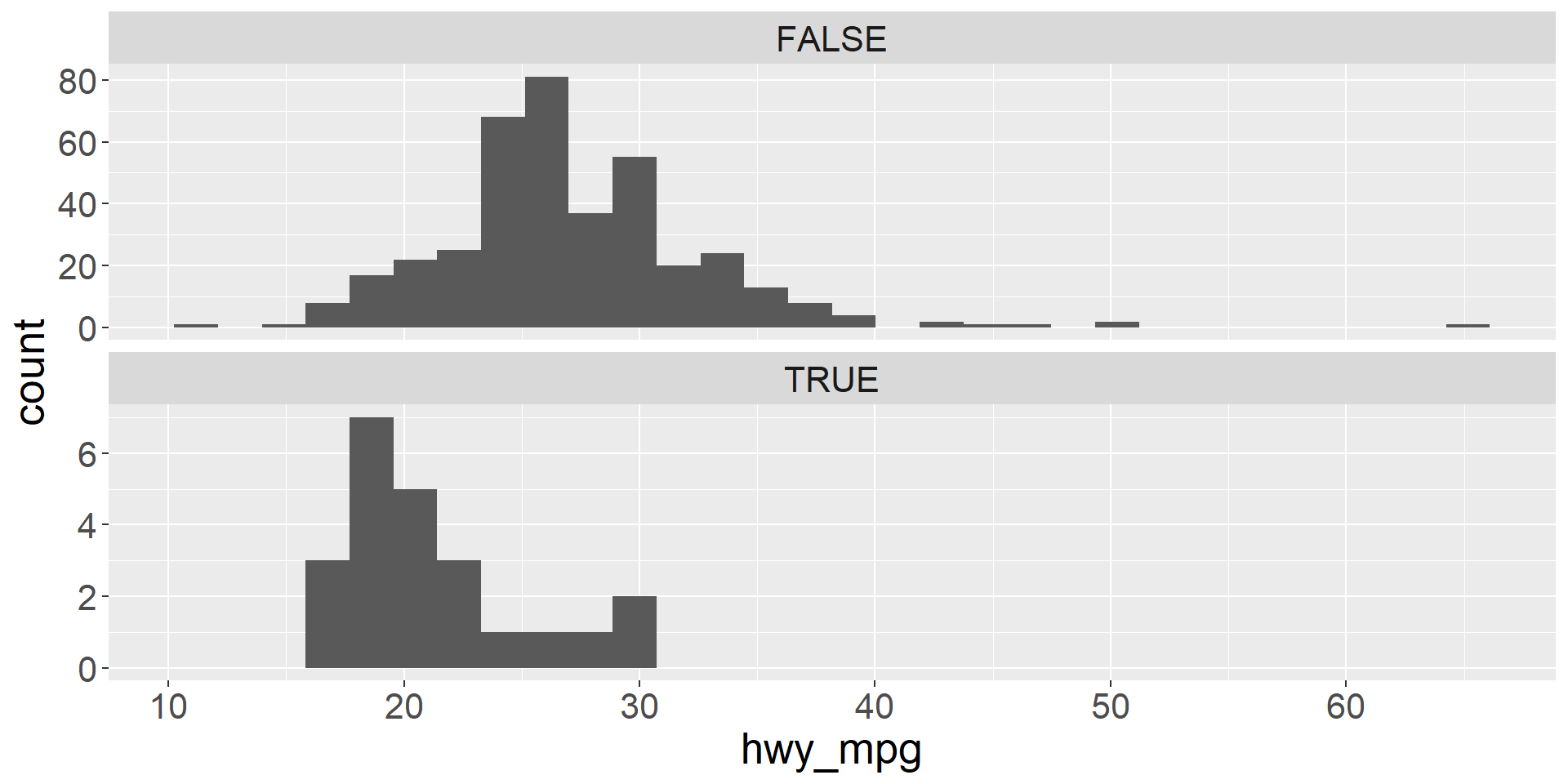
Faceted histograms
- We can visualize two variables, where one is numeric and the other is categorical using faceted histograms
- We simply plot a separate histogram for each level of the categorical variable
- Faceted histogram showing the distributions of highway mileage for vehicles that are pickups and vehicles that are not pickups
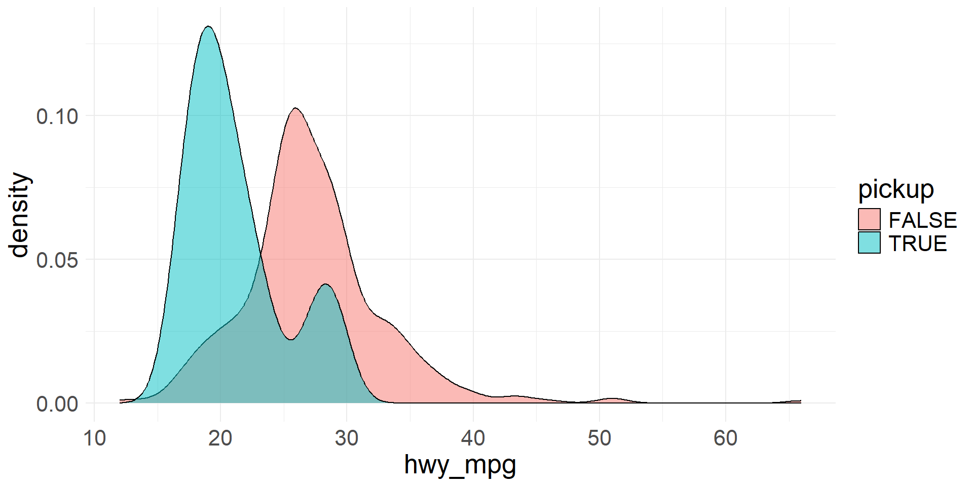
Colored density plots
- We can use colored density plots for a similar purpose
- By coloring the density plots according to the levels of the categorical variable, we can plot them on the same axes and still distinguish between the distributions
- Colored density plots to visualize the distributions of highway mileage for vehicles that are pickups and vehicles that are not pickups
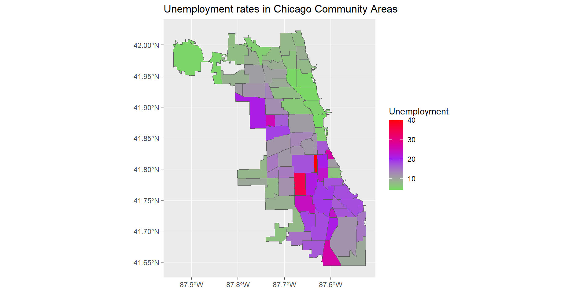
Intensity Maps
- Sometimes it is useful to use colors to show higher or lower values of variables
- Using various colors or a continuous gradient we can visualize distribution of a variable
- Intensity maps are very helpful for seeing geographical trends